
Preparations
For these analyses, we use Python and several packages. If you haven't installed them on your computer yet, you can easily do so using 'pip install', such as 'pip install seaborn'.
import pandas as pd
import numpy as np

# for visualization:
import matplotlib.pyplot as plt
import seaborn as sns
Additionally, we use a dummy dataset. You can download it here: Invoices.
We then load this into a dataframe:
file_path = "dummy_invoices_products.csv"
df = pd.read_csv(file_path, sep=";", encoding="utf-8")
1. Price Trend of Goods Over Time
By analyzing price trends over time, you can detect unusual fluctuations in costs. This helps in identifying price increases that may not have been approved or that indicate market changes.
First, we prepare the data: setting the date field correctly and calculating the unit price:
# Convert the date column to datetime format for time analyses
df['Issue Date'] = pd.to_datetime(df['Issue Date'], format='%d-%m-%Y')

# Calculate the price per unit
df['UnitPrice'] = df['InvoiceAmount'] / df['InvoiceQuantity']
Next, we visualize the data by plotting the prices per product over time using a line chart.
# Visualize price trends for selected products
plt.figure(figsize=(12,6))
sns.lineplot(data=df, x='Issue Date', y='UnitPrice', hue='ItemName', marker='o')
plt.title('Price Trend of Selected Products')
plt.xlabel('Date')
plt.ylabel('Price per Unit')
plt.xticks(rotation=45)
plt.show()
Result:
Below is the resulting chart.
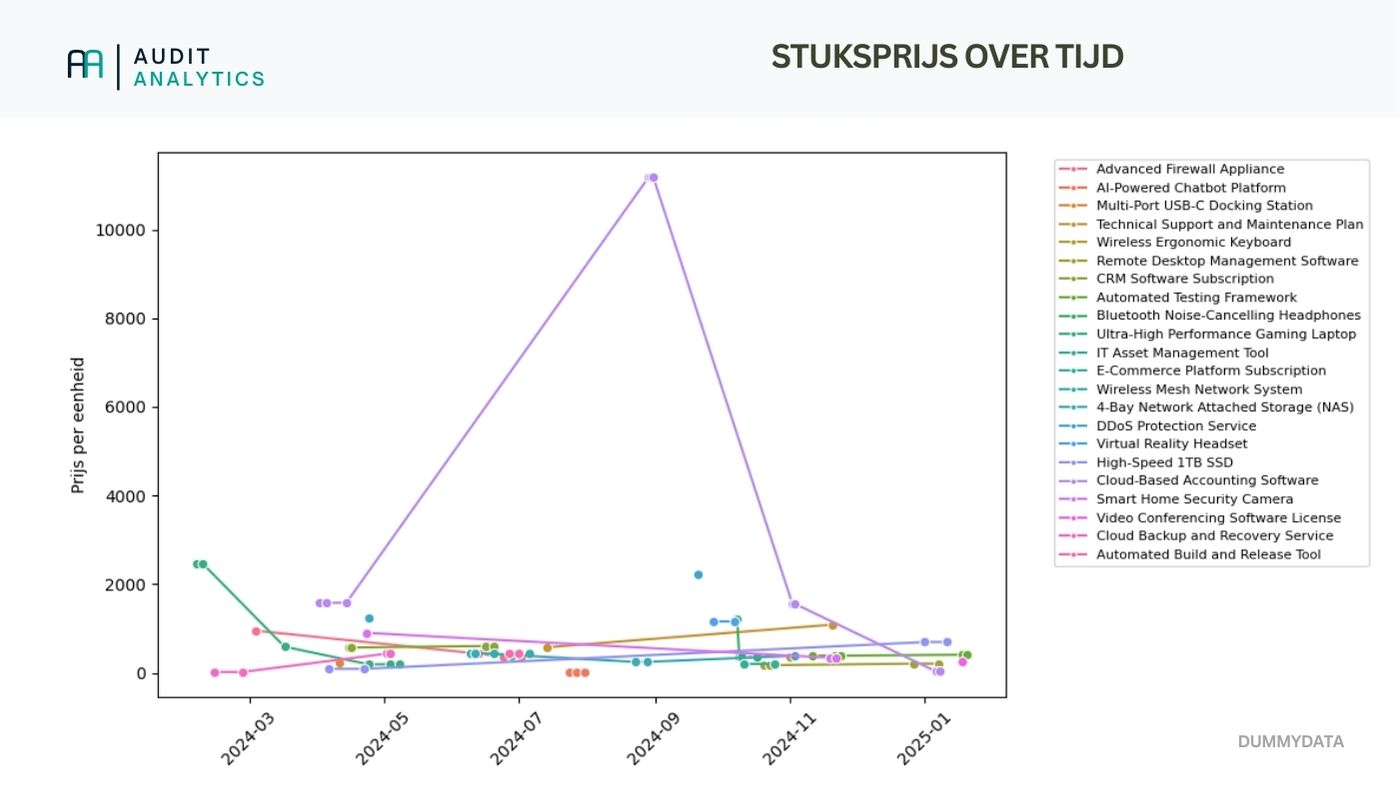
This may seem overwhelming due to the large number of products (let alone for a production dataset). However, you can already spot some patterns. You may also zoom in on frequently purchased or critical products.
2. Supplier Comparison
Comparing suppliers can help identify inconsistencies and potential overbilling. If the same products vary greatly in price between different suppliers, this may indicate inefficiencies or even fraud.
# Calculate the average price per supplier for each product
df_avg_price = df.groupby(['VendorID', 'ItemName'])['UnitPrice'].mean().reset_index()

# Compute the maximum and minimum price difference per product among suppliers
df_price_diff = df.groupby(['ItemName', 'VendorID'])['UnitPrice'].mean().reset_index()
df_price_range = df_price_diff.groupby('ItemName')['UnitPrice'].agg(['min', 'max'])
df_price_range['PriceDifference'] = df_price_range['max'] - df_price_range['min']
Now we have insight into which products show the largest price differences. Next, I recommend highlighting the largest differences and visualizing them.
# Sort by largest price difference and display the top 10 products
df_largest_differences = df_price_range.sort_values(by='PriceDifference', ascending=False).head(10)

# Select a subset of products to make the overview clearer
selected_products = ['Cloud-Based Accounting Software','Ultra-High Performance Gaming Laptop', 'Bluetooth Noise-Cancelling Headphones', 'High-Speed 1TB SSD']
df_avg_price_filtered = df_avg_price[df_avg_price['ItemName'].isin(selected_products)]

# Visualize price differences between suppliers for selected products
plt.figure(figsize=(12,6))
sns.boxplot(data=df_avg_price_filtered, x='ItemName', y='UnitPrice', hue='VendorID')
plt.title('Comparison of Purchase Prices Between Suppliers (Selected Products)')
plt.xticks(rotation=45)
plt.show()
Result:
Below is the resulting heatmap.
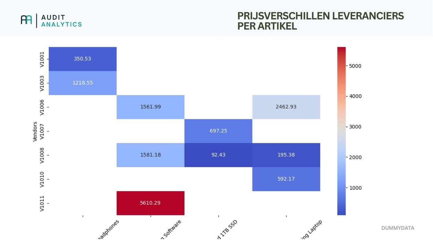
This is, of course, based on dummy data, leading to some large shifts. Nonetheless, I hope it illustrates how you can effectively analyze price differences.
3. Identifying Suppliers with Systematically Higher Prices
By identifying suppliers that systematically charge higher prices, you can assess whether contractual agreements are being followed and whether price agreements are favorable.
# Calculate the average price per supplier
df_vendor_avg = df.groupby('VendorID')['UnitPrice'].mean().reset_index()

# Sort suppliers based on average price
df_vendor_avg = df_vendor_avg.sort_values(by='UnitPrice', ascending=False)

# Visualize suppliers with the highest prices
plt.figure(figsize=(10,5))
sns.barplot(data=df_vendor_avg, x='VendorID', y='UnitPrice')
plt.title('Average Price per Supplier')
plt.xticks(rotation=45)
plt.show()
Of course, you should critically assess these results. If a company deals with a broad range of products with varying purchase prices, a significant deviation may not necessarily be problematic.
4. Detecting Outliers in Prices
We've analyzed prices over time and between suppliers, but we can also look at price anomalies. We will identify outliers. An outlier is a value in a dataset that significantly deviates from the rest. This could indicate errors or unusual pricing agreements. Below, we calculate the Z-score of unit prices and flag values with a score greater than 3. The Z-score is a statistical measure that indicates how far a specific value deviates from the mean in a dataset, expressed in standard deviations:
# Compute the Z-score of unit prices
df['Z-Score'] = zscore(df['UnitPrice'])

# Select outliers with a Z-score greater than 3 (strongly deviating)
outliers = df[df['Z-Score'].abs() > 3]
Result:
The analysis already suggested it, but the Cloud-Based Accounting Software from supplier V1011 stands out significantly:
   VendorID                         ItemName     UnitPrice   Z-Score
38    V1011  Cloud-Based Accounting Software  11183.403433  4.830462
39    V1011  Cloud-Based Accounting Software  11183.403433  4.830462
40    V1011  Cloud-Based Accounting Software  11183.403433  4.830462
Conclusion
In this article, we examined purchase prices using four simple analyses. Although we used dummy data, I hope this serves as inspiration for your own analyses!


